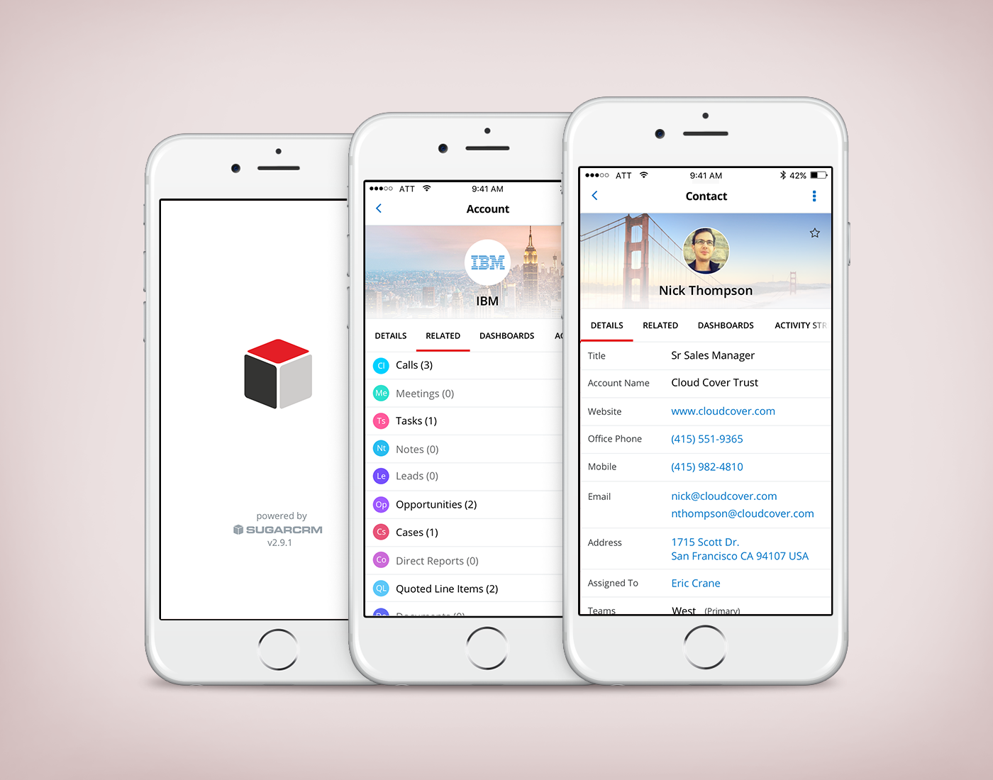
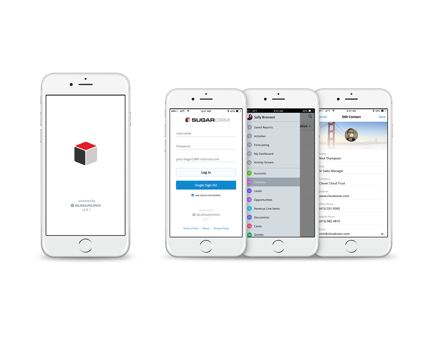
SUGARCRM MOBILE APP
Responsibilities included developing UX/interaction and conducting usability study. Worked with product visual designer for web to identify visual guidelines for mobile.
SugarCRM is a cloud-based customer relationship management solution to help businesses track their customers and sales pipelines. Customers include Apple, IBM, JP Morgan Chase, and Sherwin-Williams.
The Challenge
In one-on-one interviews, users often reported feeling overwhelmed by their interaction with the
mobile app. Many of them expressed a desire to customize various pages to fit their needs. As we ascertained our customers’ main goals in using the mobile app, we explored ways to better assist them in achieving their objectives faster and with more efficiency.
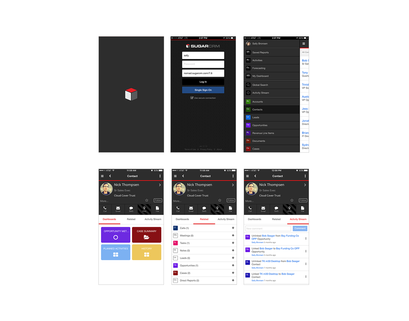
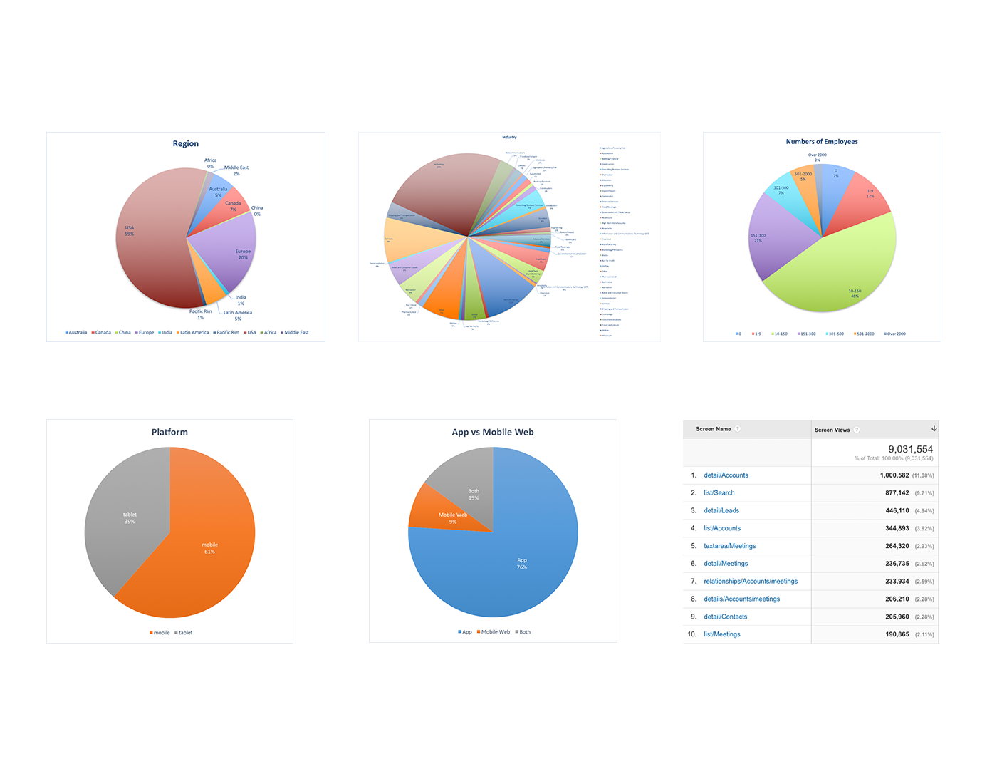
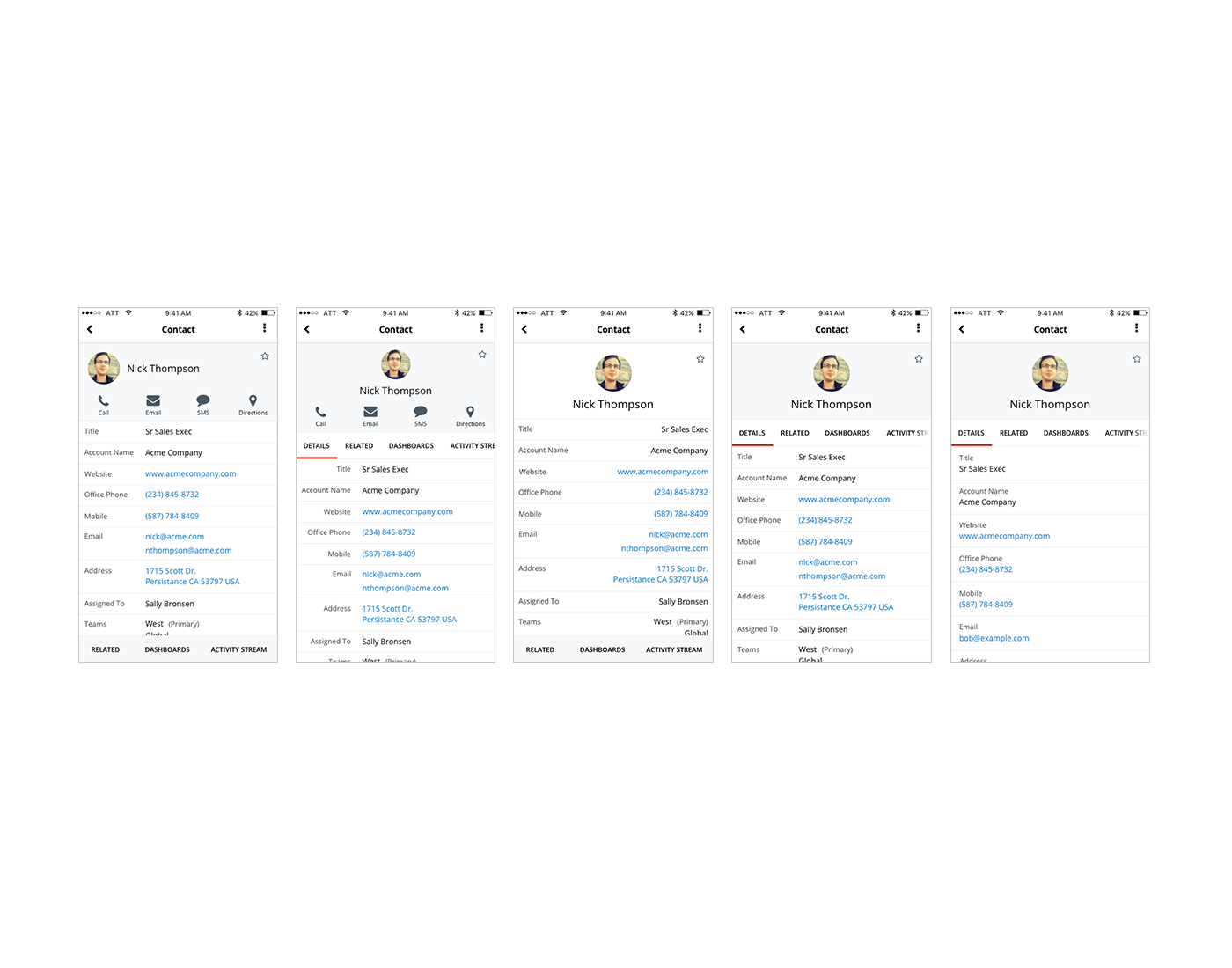
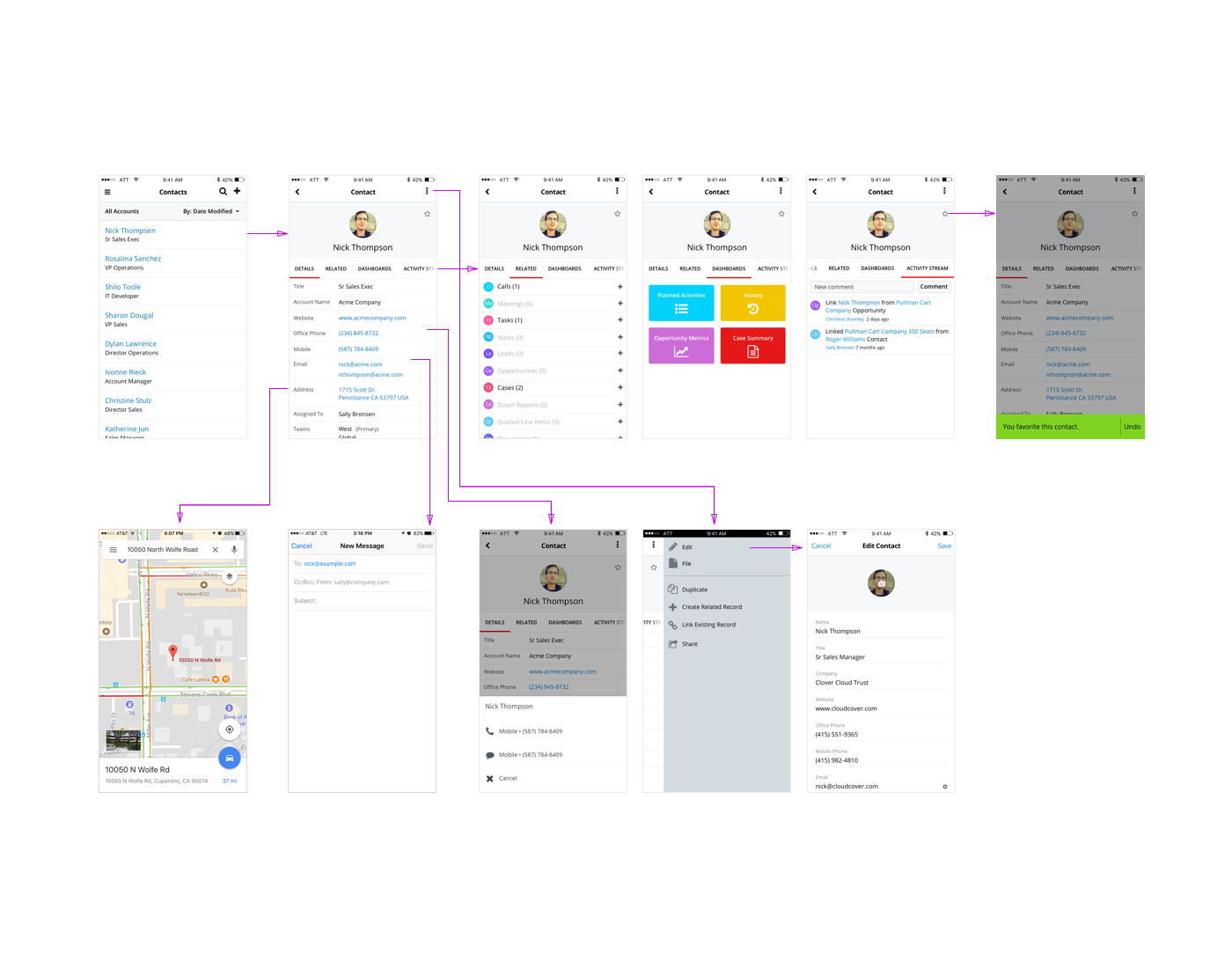
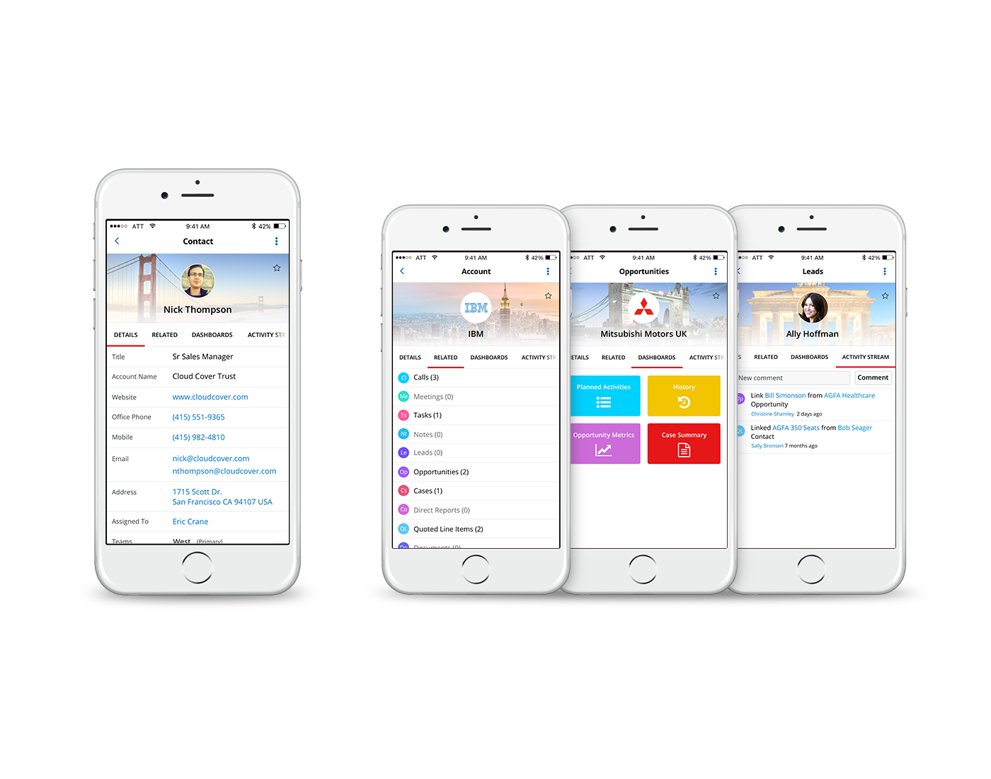
Analytics showed that approximately 68% of user activity occurred in the “detail view” screen, which is the foundation to various main pages within the app, such as accounts, leads, contacts, etc. We concentrated on this screen, with primary goals to:
- Create clarity and prioritize scannability
- Allow actions and fields to be more extensible
- Create clearer actions
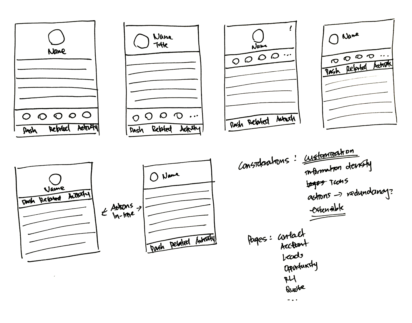
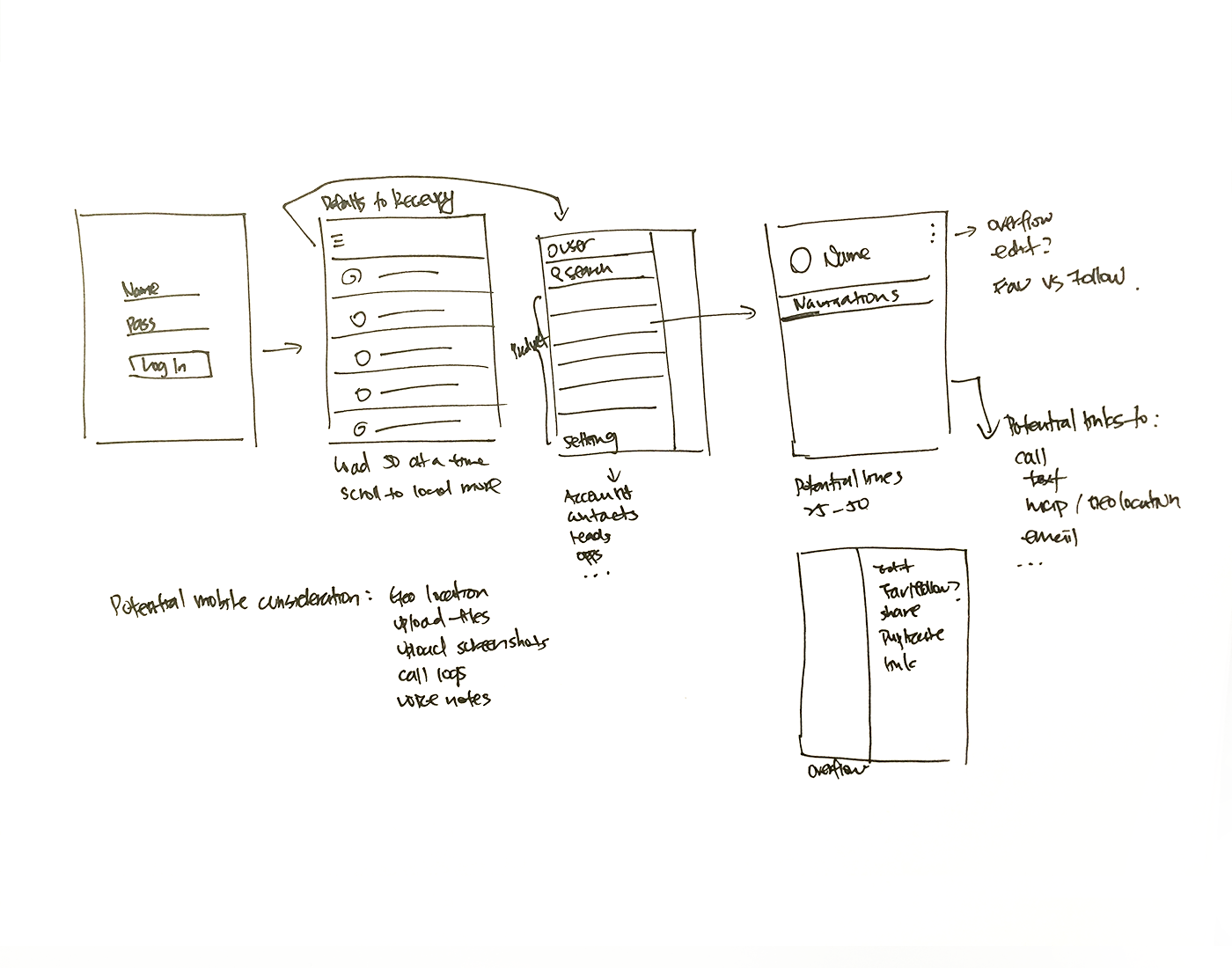
Brainstorm/Ideation
I poured over the current functionalities, compared them with analytics, and conducted
interviews to understand what types of information and actions our customers found most valuable. With the new design, I focused on surfacing the content most relevant to users, and reorganizing flows of action to allow for a more thoughtful information architecture.
I especially considered the fact that the app was created with HTML, rather than native code.
Since iOS and Android platforms both employ the same design, we needed to accommodate for users on two separate platforms, utilizing different design guidelines and styles. Various Google apps on iOS served as the benchmark for many of the design style decisions.
Usability Testing
Through usability sessions with five participants - both customers and internal sales representatives - I gathered information about their day-to-day work flow and use cases. Participants were then instructed to go through the prototypes and complete certain tasks. I wanted to find out whether the new designs captured their use cases, and also delve into any other areas of potential improvement.
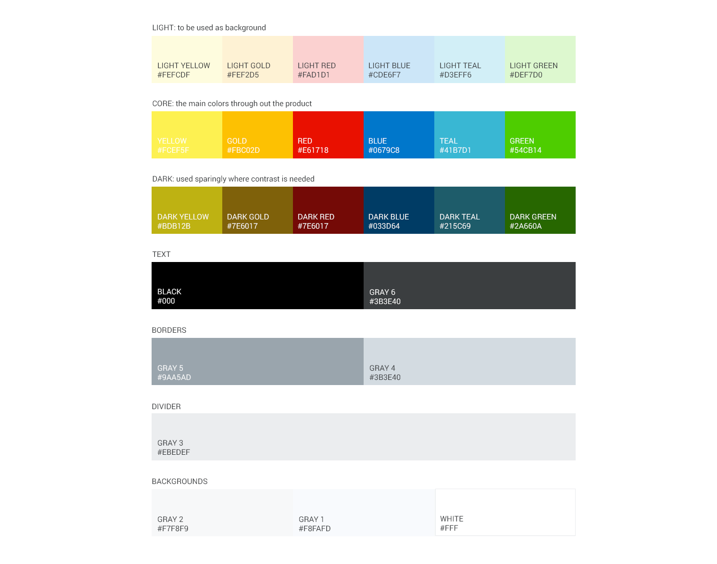
New Visual Language
The focus groups described our old visuals as “outdated” and “dense.” This valuable feedback drove the design philosophy for our project: modern, clear, consistent, lightweight, adaptable, and efficient. It also inspired us to establish a concise color palette and wider font to increase legibility on smaller devices.
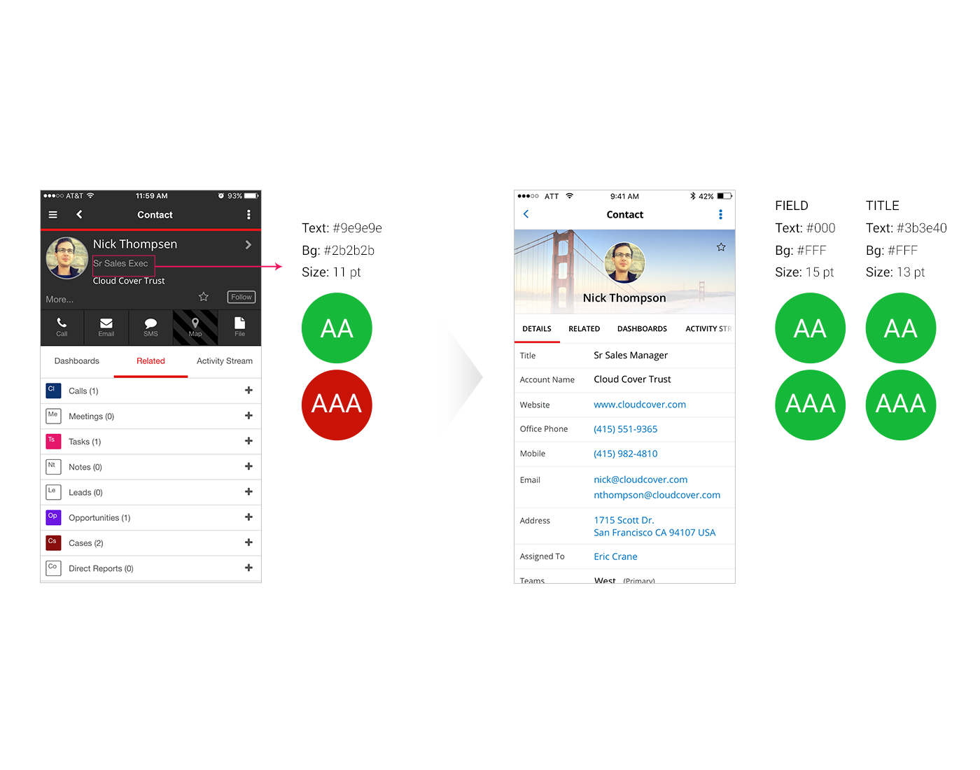
Accessibility
As part of the visual and UX re-design, one of the main factors we took into account is bringing the design up to WCAG 2.0 standards for both level AA and AAA. We focused on:
- Color contrast
- Font legibility
- Clarity and mental effort
Results
Based on usability study and data from beta tests, 100% of users opted for the new design. Users reported that the lighter colors and updated layout made the content feel more lightweight and digestible. Overall, users can now consume the information more easily and with greater clarity, without compromising any feature parity.