UPWORK iOS APP
Responsible for UX/interaction, as well as establishing visual guidelines for iOS. Worked with research consultant to conduct the usability study.
Upwork (formerly Elance-oDesk) is a professional marketplace for freelancers. With the goal to allow clients “work effortlessly with freelancers anywhere,” Upwork decided to invested more in their mobile app, focusing on the applicant tracking system.
The Challenge
Only 40% of clients who posted a job on the platform ever returned to view their applicants. We set out to understand the disconnect - why users didn’t come back to the platform to complete their hiring process, and how we could encourage a higher rate of return, ultimately increasing the hiring rate.
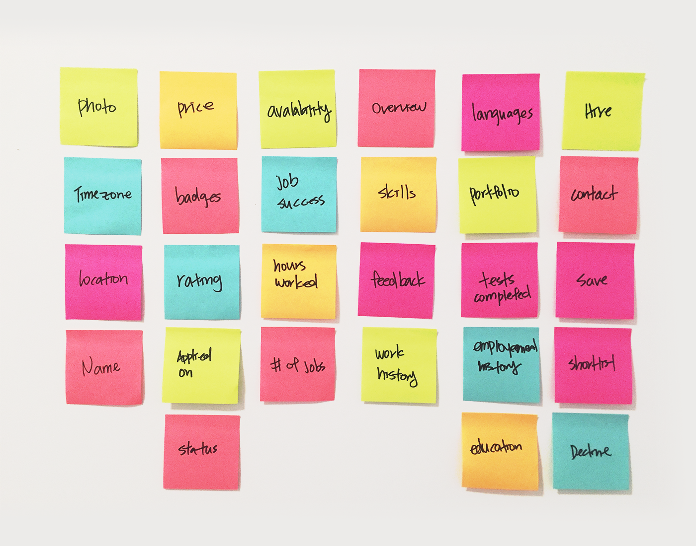
Brainstorming
I began by sorting through all the current information and actions available on the web platform, at the same time identifying additional mobile features and functionalities we could incorporate. The rigorous sorting and elimination process allowed me to identify the key data and actions necessary for the success of the feature.
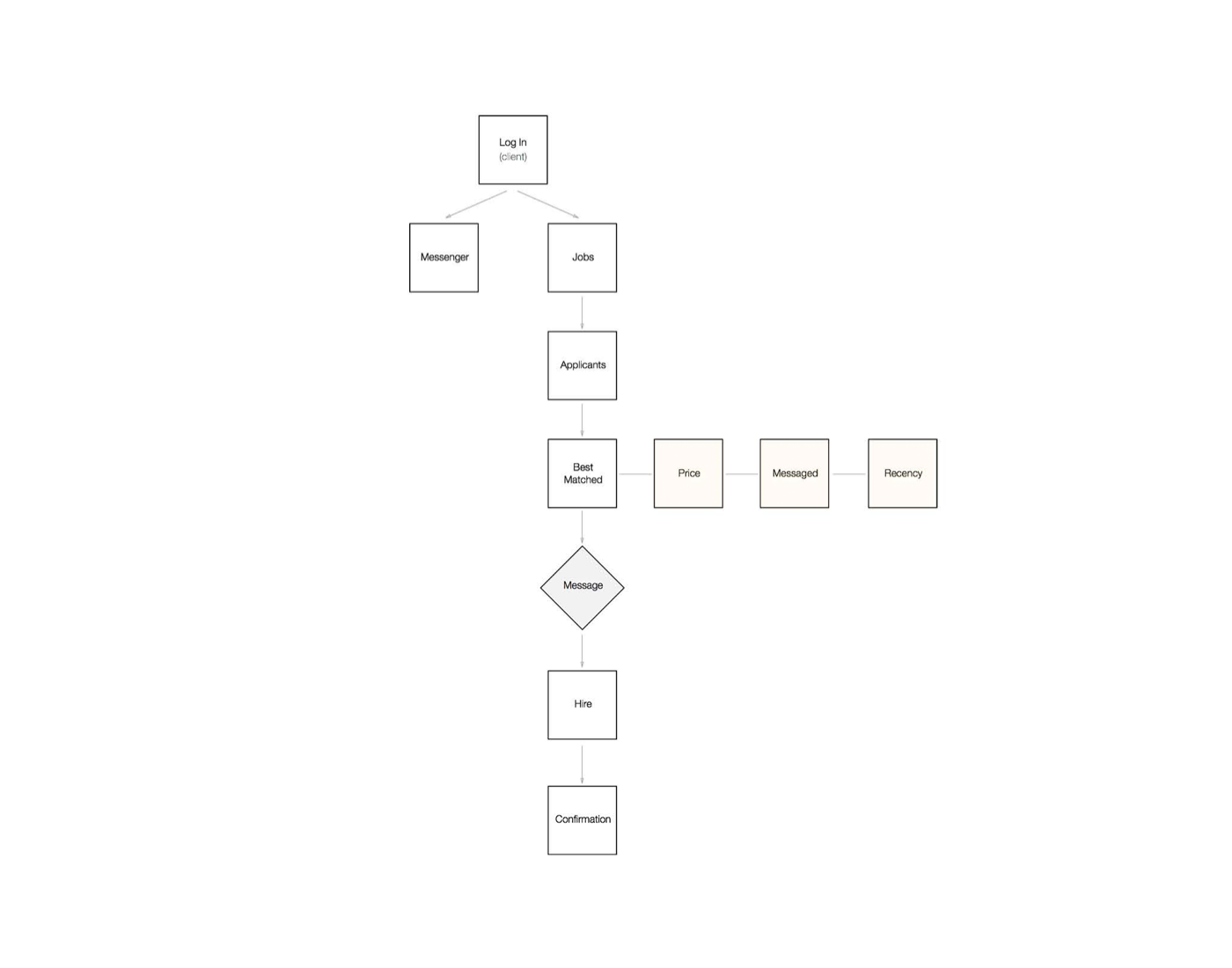
Flow
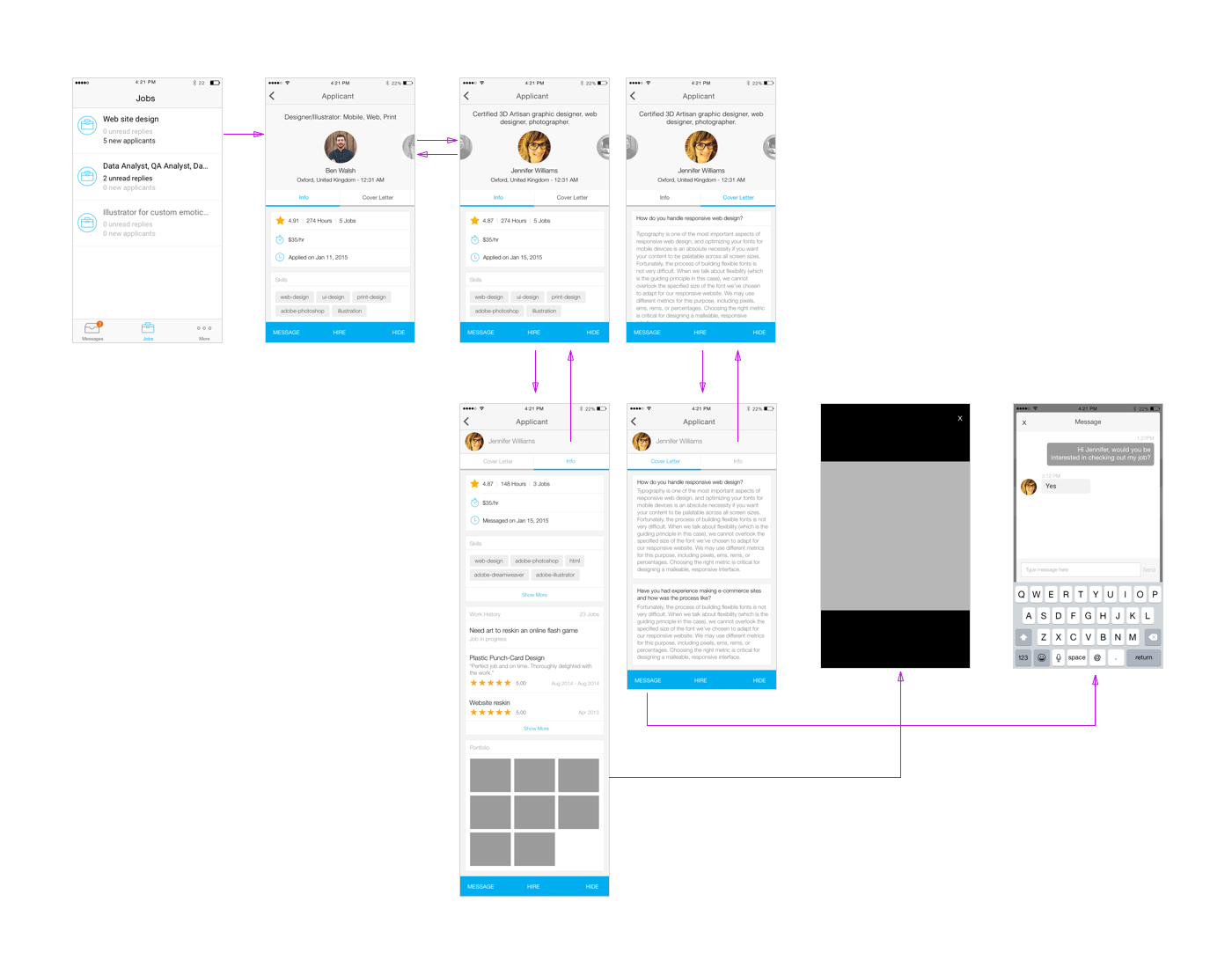
Part of the brainstorming session involved defining the feature flow. The high-level flow helped the team frame the solution for the problem, and seek out potential challenges and bottlenecks within our platform's ecosystem.
Ideation
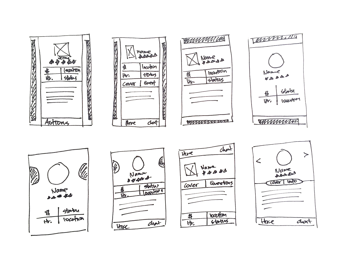
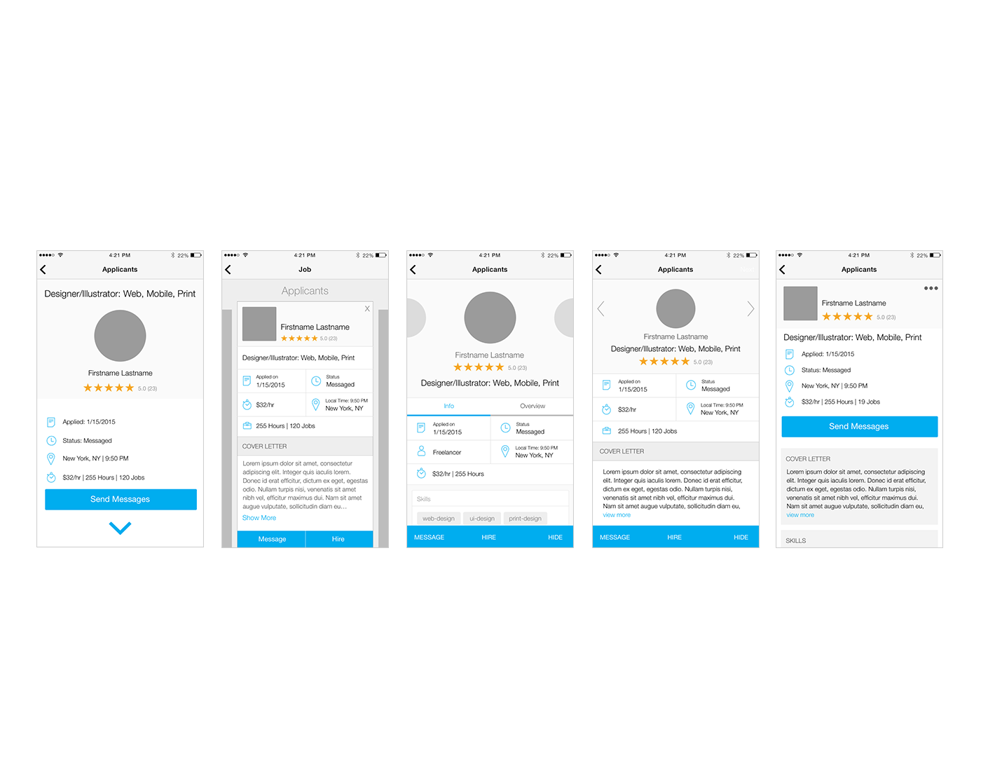
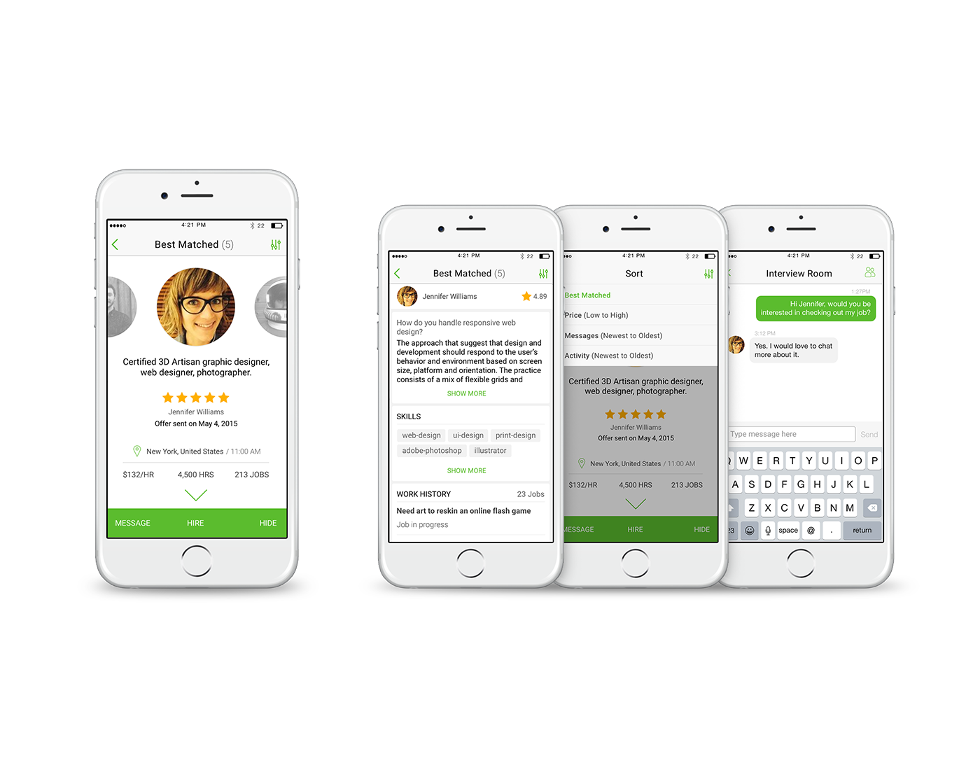
Knowing that displaying a large number of applicants would overwhelm users on mobile devices, we decided to showcase a curated list of applicants, helping to focus the information for the user. I began with a competitive analysis, and took inspiration from top travel and dating apps to develop a sleek, unified profile view. I started by creating paper sketches that helped me explore various layouts and interactions on the computer.
Some of the main considerations during the ideation phase were:
- Architecture and layout of the most pertinent information
- Interaction model on profile switching
- Main user actions
- Incorporation of the feature to the platform
Iteration
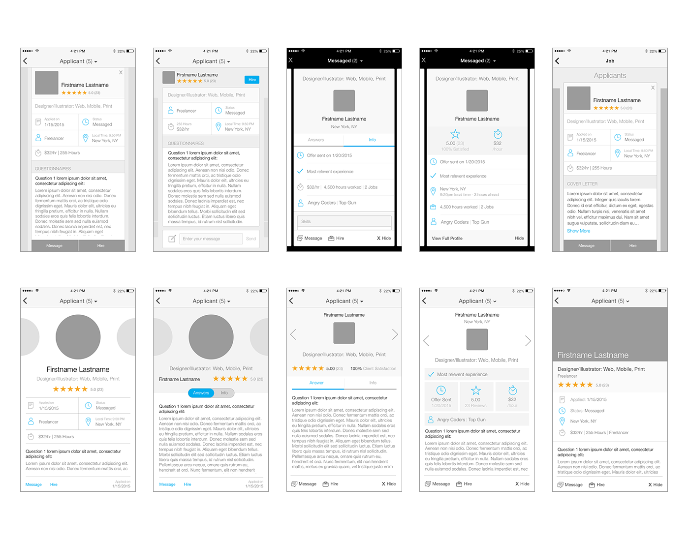
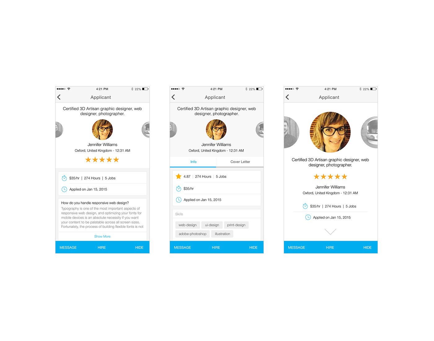
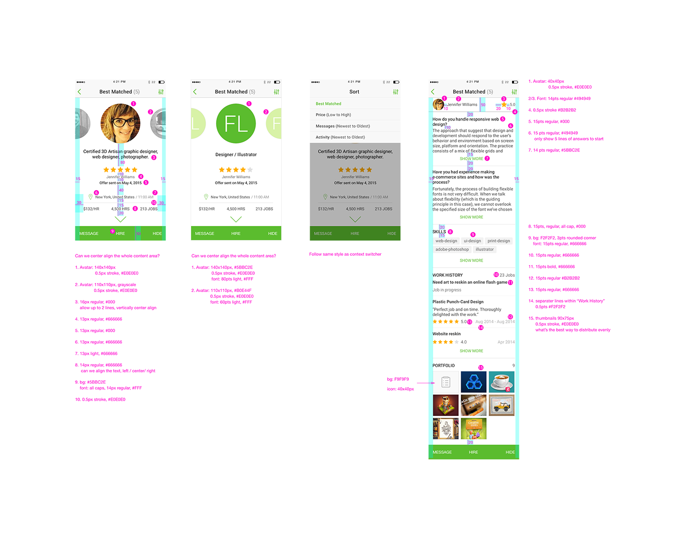
I identified three design variations, while highlighting the most important hiring criteria. Card-based design helped separate potentially dense blocks of text and data. Surfacing important actionable links made it easier for clients to navigate the feature.
I poured over the amount of information offered on the web platform, and paired that with the strength of connectivity on the mobile platform. The design not only allowed users to browse all the most important applicant information, but it also encouraged them to chat with the applicants before hiring, to gain familiarity and ease anxiety associated with remote hires.
Usability Test
We conducted a usability study featuring six users. During the 30-minute session, we watched as they navigated through the prototypes while verbalizing their experience and expectations. Consistent feedback told us that users would appreciate the ability to quickly compare their applicants based on certain key criteria.
Visual and Spec
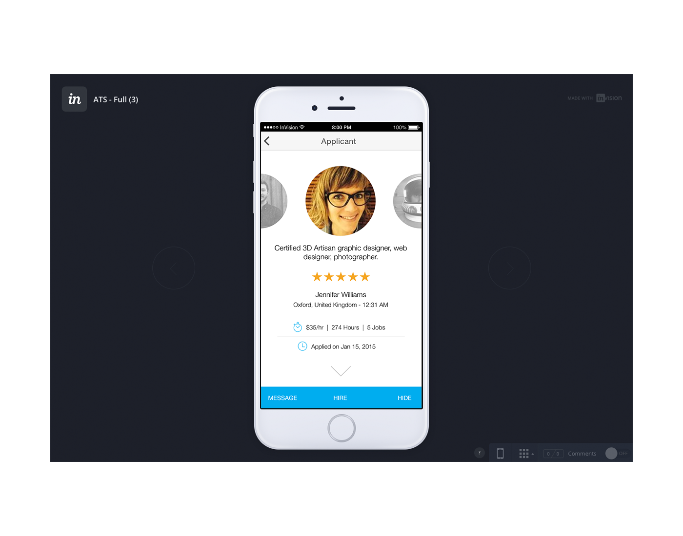
During the development phase, Elance-Odesk went through an rebranding effort and is now called Upwork. I utilized the new brand color palette and style guidelines to develop visuals for the feature as well as an updated visual guideline for the mobile platform.
Result
I added a “sort” functionality to the final product, enabling users to compare applicants at a glance. The feature tested extremely well, and after our new design was implemented, 89% of the beta testers came back and viewed their applicants on mobile.